Taykit was a brand new Bangalore based startup building India’s most efficient solution to the messy Last Mile Delivery problem in e-commerce.
Develop a unique brand identity, which would reflect the company’s vision and mission, aimed at increasing buyer convenience and e-tailer.
Before even sketching down the logos, a brief understanding was recommended from the stakeholders to broaden the thought process through phone calls.
A catalog about What works well for them? If yes Why it works? What doesn’t? How it will be interpreted by users? Made a list of these observations. Once I got a clear understanding, I let that inform through my design direction.
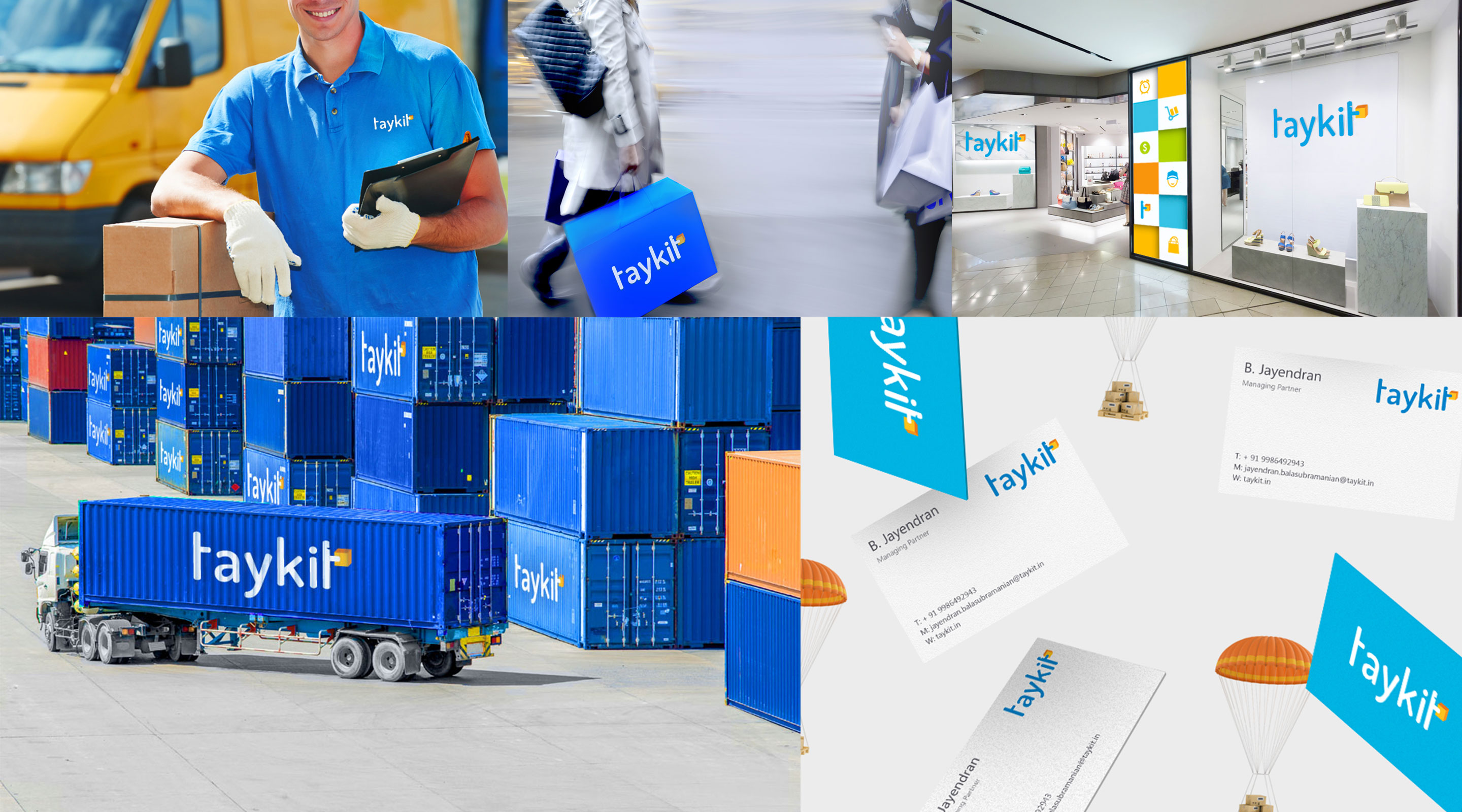
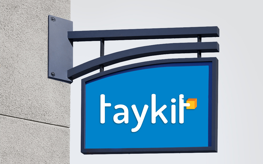
In order to create a visual identity, which would easily reflect client’s business and correspond with it’s positioning as serious and reliable company. I decided to bring out last mile service through carton box for a score of reasons.
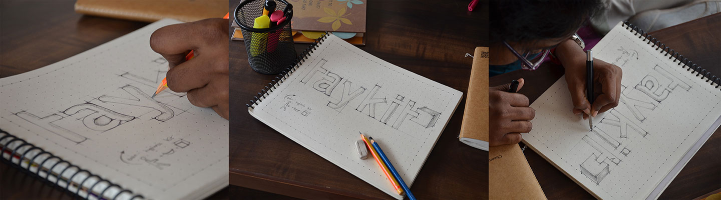
The text part of the logo had to be pretty simple and practical at the same time. The intention of the Logo Symbol was to match the “T” letter with person taking carton box in a creative manner. After several variations and alterations of the Idea, I decided to combine the “T” letter(last letter of the company name) with curves of a person smile while walking out with carton box (delivered consignment). As you can see the parts perfectly and practically match each other.
The first letter "T" symbolizes their POD set up, thus the text in the logo concept is not just the naming, but also very practically fulfills and merges into the concept philosophy.
The finished logo concept consists of two separate thematically connected features of PODS setup and smile in last mile delivery service, which perfectly depicts the consumer’s emotion in a best way. The simplicity of the concept makes it easy to remember and provides the fast visual involvement of the viewers, thus creating an efficient base for further brand marketing.